UP Refreshes Locomotive Paint Scheme, Keeping Iconic Flag Design
-
- Saver of all History
- Posts: 4875
- Joined: Wed Oct 27, 2004 10:35 pm
- Location: Feel the Zeel, MI
- Contact:
UP Refreshes Locomotive Paint Scheme, Keeping Iconic Flag Design
September 16, 2022
https://www.up.com/aboutup/community/in ... 220916.htm
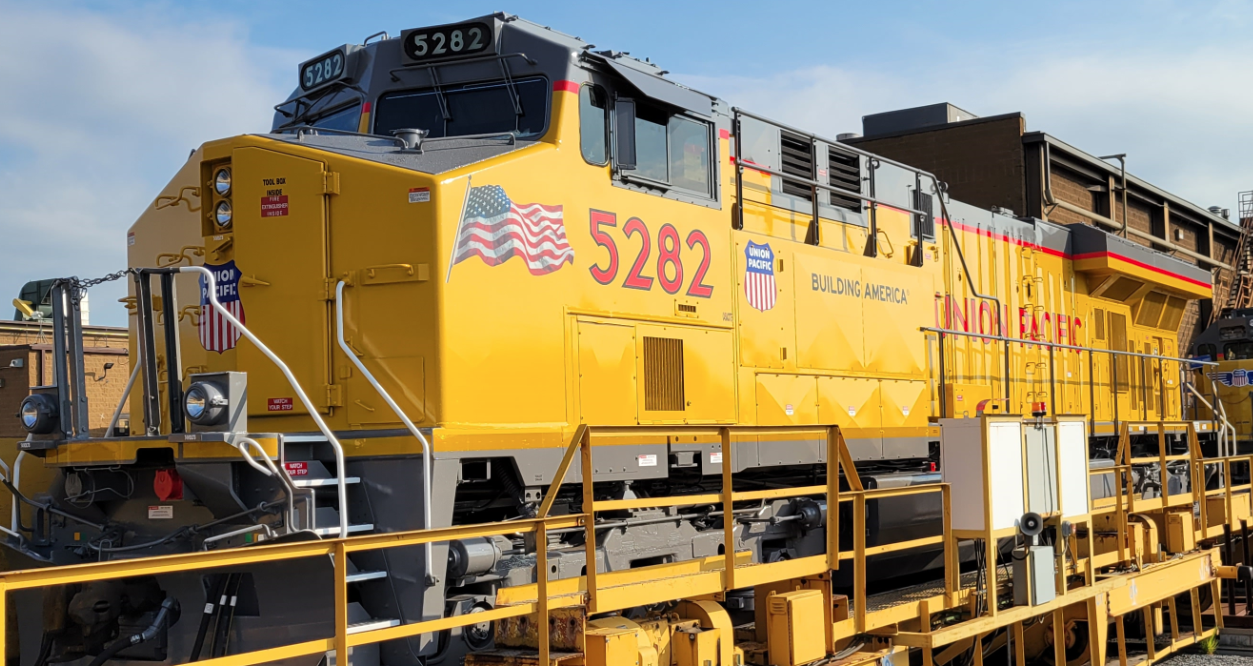
Union Pacific finalized its new locomotive paint scheme – moving the placement of but keeping its iconic flag design, which was rolled out over 20 years ago to honor the victims of 9/11. The first Union Pacific locomotive with the refreshed paint scheme is now in service.
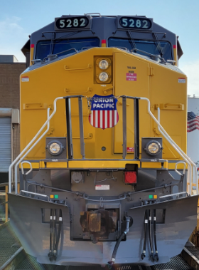
Front view of Union Pacific's new locomotive paint scheme.
The final design comes after testing and receiving feedback over the summer on a design that changed the look of the flag and its position. Union Pacific adjusted the flag’s placement after receiving employee feedback the image was sustaining wear due to engine heat. The new placement is meant to keep the flag in pristine condition, honoring it as a sacred symbol.
“Union Pacific has long been an integral piece of the U.S. economy moving America forward, and the flag on our locomotives is a great representation,” said Lance Fritz, chairman, president and CEO. “We want to ensure that although the placement has changed in order to best represent the flag, we continue to honor our roots as we build America.”
Employees at the Jenks Locomotive Shop in North Little Rock, Arkansas, will implement the new design as locomotives come in for modernizations or overhaul work. The first SD70ACe locomotive with the revised new paint scheme is the UP8608, which made its service debut Sept. 12.
--------
It looks like they tweaked the flag design into a smaller version of what has been splashed (and often torched) on the carbody sides from the first iteration of this scheme. Also, the shield is delightfully smaller on the nose. See this earlier version: https://www.up.com/aboutup/community/in ... 220725.htm
- Saturnalia
- Authority on Cat
- Posts: 15412
- Joined: Wed Sep 28, 2011 7:54 pm
- Location: Michigan City, IN
- Contact:
Re: UP Refreshes Locomotive Paint Scheme, Keeping Iconic Flag Design
They should have kept the wings on the nose.
- DaveO
- Read more, think more, post less
- Posts: 1469
- Joined: Thu Dec 14, 2017 12:57 pm
- Location: Between here and there
Re: UP Refreshes Locomotive Paint Scheme, Keeping Iconic Flag Design
Remove the flag. I don't like companies using the flag for commercial purposes.
Especially the ones that don't keep it looking in good condition.
- David Collins
- Youtube Railfan Guru
- Posts: 2859
- Joined: Fri Sep 25, 2020 10:46 am
- Location: Bloomfield Hills, Mi
- Contact:
Re: UP Refreshes Locomotive Paint Scheme, Keeping Iconic Flag Design
Unpopular Opinion, I actually LIKE the nose without the wings. It gives me retro vibes for some weird reason. Other than that, it sucks, I totally agree with what DaveO said about the flag being on the engine. If you can't take care of something that symbolizes your company, it makes no sense to keep it.
-
- Saver of all History
- Posts: 4875
- Joined: Wed Oct 27, 2004 10:35 pm
- Location: Feel the Zeel, MI
- Contact:
Re: UP Refreshes Locomotive Paint Scheme, Keeping Iconic Flag Design
I agree with DaveO, but I think the decision to move the flag to the front flank was made 100% because of the discoloration and destruction of the flag graphic on the carbody sides. It’s no joke Armour Yellow does not seem to age well, the flags usually look terrible.
I really like the billboard lettering returning to the carbody sides. They’ve had the UNION PACIFIC lettering spelled out a Since at least the E7 era in the same font. I could take or leave the wings. They look good on some noses, less so on other designs. The UP Shield certainly stands out more without them. Pluses and minuses all around, I guess!
- LansingRailFan
- Railroadfan...fan
- Posts: 11428
- Joined: Fri Nov 01, 2019 4:21 pm
- Location: Lansing
- Contact:
Re: UP Refreshes Locomotive Paint Scheme, Keeping Iconic Flag Design
100%. Otherwise I enjoy the scheme.
-
- Saver of all History
- Posts: 4875
- Joined: Wed Oct 27, 2004 10:35 pm
- Location: Feel the Zeel, MI
- Contact:
Re: UP Refreshes Locomotive Paint Scheme, Keeping Iconic Flag Design
I found this article on the history and subtle changes of the Armour yellow scheme to be interesting: https://www.trains.com/ctr/railroads/lo ... s-changes/
-
- Saver of all History
- Posts: 4875
- Joined: Wed Oct 27, 2004 10:35 pm
- Location: Feel the Zeel, MI
- Contact:
Re: UP Refreshes Locomotive Paint Scheme, Keeping Iconic Flag Design
UP does more tinkering with its new locomotive image and detailing:
https://www.trains.com/trn/railroads/lo ... nt-scheme/
- Saturnalia
- Authority on Cat
- Posts: 15412
- Joined: Wed Sep 28, 2011 7:54 pm
- Location: Michigan City, IN
- Contact:
Re: UP Refreshes Locomotive Paint Scheme, Keeping Iconic Flag Design
I’m surprised anybody at UP allowed the different lettering font. They are serious as heck about their branding and their brand guide makes it very clear that you’ll use what you’re supposed to. And they don’t like any variation and even spelled out when you can use what and everything.GP30M4216 wrote: ↑Tue May 09, 2023 9:15 pmUP does more tinkering with its new locomotive image and detailing:
https://www.trains.com/trn/railroads/lo ... nt-scheme/
-
- Railroadfan...fan
- Posts: 280
- Joined: Sun Jun 16, 2019 10:25 am
Re: UP Refreshes Locomotive Paint Scheme, Keeping Iconic Flag Design
I am probably the only one to say this, but-- I really wish the UP colors would go away. They are beyond boring, and have not changed in my lifetime. Let's get something else. Again--- just my opinion.